Voice Graph
Feb 2026
A data-visual direction for comparing human and synthetic voice, focused on making waveform rhythm readable before making it decorative.
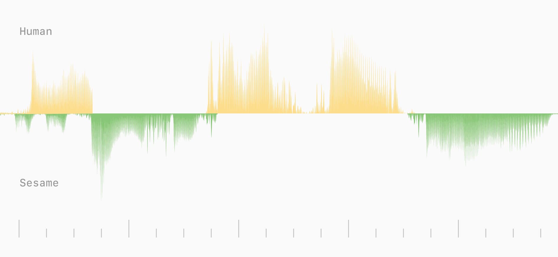
Voice Graph is a visual direction study for comparing human speech with synthetic voice output. The screenshot is sparse on purpose: first the waveform has to be readable, then it can become expressive.
The color choice changes the mood of the data. Yellow peaks and green negative space feel more humane than a cold analytics palette, which matters when the subject is voice.
The first design question is orientation. A viewer needs to know what side is human, what side is generated, and where the meaningful rhythm changes are happening.
The second question is annotation. A waveform without notes can look impressive while saying very little, so the next version should add markers, playback, and a short explanation next to the data.
This can become a more complete interactive study once the audio and visual layers sit together.