Overlay
Apr 2026
A visual study for a beauty product page where one strong image, one headline, and one waitlist action carry the whole first impression.
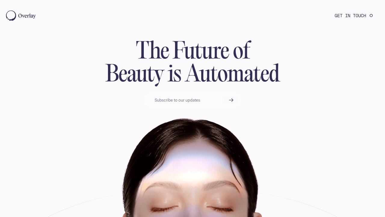
Overlay is a landing page study for a beauty product that feels automated without feeling sterile. The trick is making the page look precise and calm while still giving it a little editorial drama.
The first viewport does almost all of the work: mark, headline, waitlist action, and the face entering from the bottom edge. There is no feature grid to hide behind, so the composition has to feel finished.
The headline is intentionally oversized and centered. It gives the concept a confident product-world signal before any explanation appears.
The input sits underneath like a quiet commitment point. It should feel light, not salesy, because the rest of the page is already asking the viewer to buy into a mood.
This is a useful template for later work: one strong visual, one clear action, and enough restraint that the product can still grow into the page.