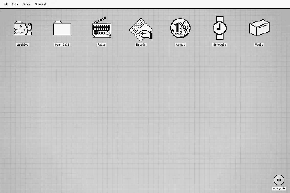
Desktop Guide
Mar 2026
A small operating-system study about restraint, icon pressure, and making a sparse pixel interface feel intentional instead of empty.
Desktop Guide is a small operating-system study: a pixel grid, a row of tools, and just enough interface chrome to make it feel like a screen you could touch.
The point is not nostalgia by itself. It is the discipline of working inside a strict visual language where every icon has to be legible at a small size and every label has to earn its place.
The first pass keeps the page almost empty. That negative space matters, because a desktop full of icons becomes noise immediately.
The icons are the interesting part. They can be silly, functional, or weird, but they need to share the same pressure: black lines, small labels, and a grid that refuses to drift.
The next version can turn each icon into a real section: archive, open call, radio, briefs, manual, schedule, and a vault for project notes.