Notes on Motion
Apr 2026
Motion should give the reader spatial memory. These are notes on route morphs, quiet reveals, and the difference between polish and noise.
Good interface motion feels like the page already knew where it was going. It does not announce itself as an effect. It gives your eye a path, preserves a little spatial memory, and makes the next screen feel connected to the one you just left.
The bad version is easy to spot because it has no job. Things slide in because they can. Cards bounce because a spring preset looked fun. A button grows, a section fades, a screenshot rotates, and none of it helps the person understand what changed.
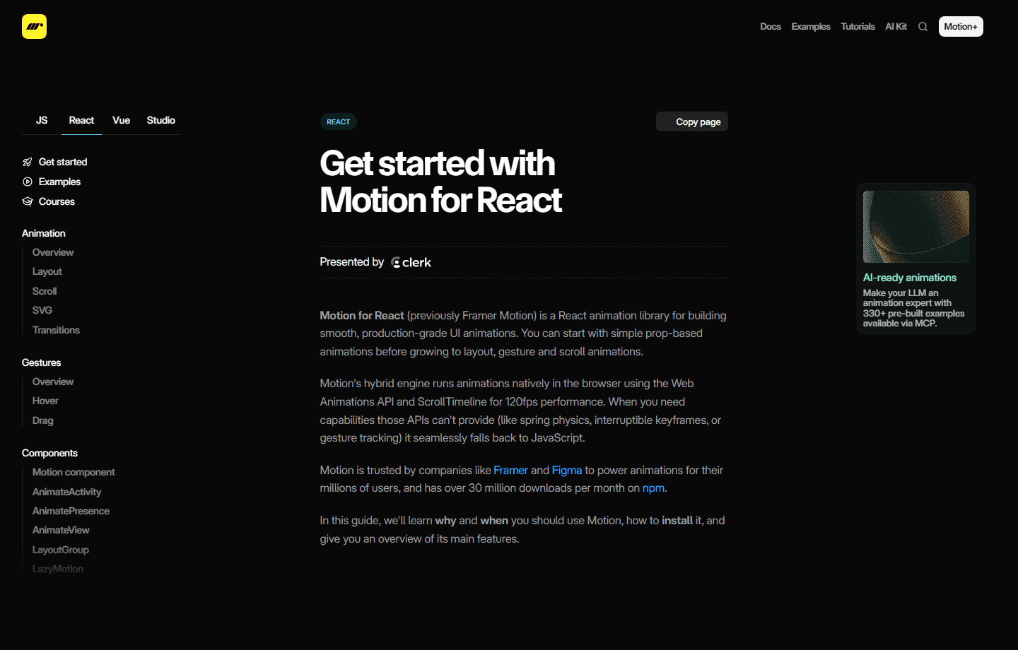
The references I keep coming back to are practical: the Motion docs for thinking in values, and the browser's View Transitions API for the idea that navigation can feel continuous instead of like a hard cut.
For this portfolio, the useful rule is narrow. The selected thumbnail should become the hero image. The rest of the page should soften while that happens. The article should wait for the image to land, then let the title and body enter quietly. The animation earns its place only if the project becomes easier to understand.
The details matter more than the size of the gesture. A close button that is two pixels too low feels careless. A hero image that appears before the morph finishes breaks the illusion. A body paragraph that fades before the cover has landed makes the page feel like two systems fighting each other.
Motion should make the site feel handled. Anything louder than that has to prove itself.