What I Am Learning Now
May 2026
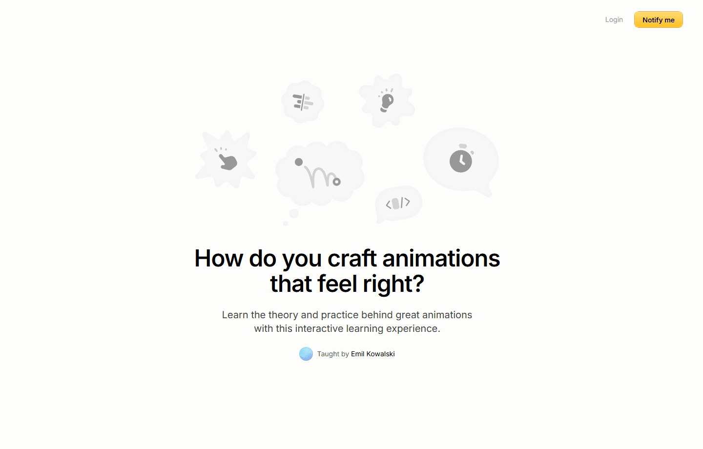
A practical map of what I am learning from animations.dev: timing, feedback, continuity, and the taste to make motion feel useful instead of decorative.
Right now I am learning animation craft from animations.dev, not because I want every page to move more, but because I want motion to feel more correct. The good stuff is not the dramatic transition. It is the timing, the pause, the softened edge, and the way an element seems to arrive from a place that already made sense.
That is the part I am trying to train: when a hover should be instant, when it should breathe, when the page should avoid motion completely, and when a transition can help the reader keep their place. A portfolio can look expensive and still feel cheap if every movement is fighting for attention.
The practical lesson is that motion is mostly restraint. A row reveal should make the list easier to scan. A thumbnail morph should connect the list to the article. A body paragraph should not fade in so slowly that reading feels delayed. The animation has to serve the next action.
I still keep the wider frontend track close by: React, CSS, accessibility, responsive spacing, image crops, and the boring checks that reveal whether a page actually works. But animations.dev is useful because it gives language to the part that is harder to explain: why one interaction feels handled and another one feels like a preset.
For this site, the goal is not to copy the course. The goal is to absorb the taste: fewer gestures, clearer continuity, less blur, more readable surfaces, and motion that respects the writing instead of becoming the main character.
The standard for now is simple: build small pages, make them readable, give them just enough movement to feel alive, and remove anything that makes the work harder to understand.