Design References
Mar 2026
References are useful only when they teach a decision. This is how I try to borrow structure without copying the costume.
A reference is only useful if it teaches a decision. Copying the surface gets old quickly. Understanding why the surface works gives you something reusable without becoming a weaker version of the thing you admire.
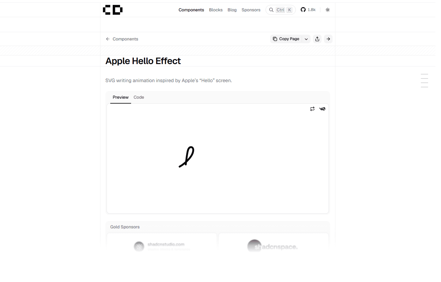
The best references are usually specific. A narrow column. A divider that almost disappears. A warm dark background that does not turn muddy. A hover state that focuses attention by letting everything else fall back. The Apple Hello lettering file, and implementations like Apple Hello Effect, are useful to me for that reason: one gesture can carry personality immediately.
Those details add up because they reveal what the designer cared about. They also reveal what the designer was willing to leave out. That second part is easy to miss.
Most weak portfolio pages are not weak because they lack ideas. They are weak because every idea is visible at once. There is no hierarchy, no silence, no confidence that the work can survive without being surrounded by decoration.
For this build, the reference is not a costume. The useful lesson is the discipline: one readable column, a small number of rows, project pages with real explanation, and motion that feels connected instead of random.
The goal is to make a place where better work can land later, not a frozen imitation that falls apart as soon as the screenshots change.